 Julie Raasch
Initial sketches were worked through, then several of the top ideas were worked up in Illustrator and passed along to the client. At this point the client determined that they did not want a smile or mouth as part of the logo. They liked the idea of a tree.
The tree was further developed and I decided that 32 leaves would be on it, to represent the 32 teeth in the human mouth. A triangle, Delta, representing dentistry was interwoven with the tree. Note: Delta is also part of the official emblem of dentistry.
Fonts were explored and several were chosen to pair with the tree images and fleshed out.
Two fonts were selected and color combinations were developed. 20 of the 32 teeth are of a different color. The 32 leaves represent the 32 teeth of a human's permanent dentition. The 20 of a differnt color represent 20 primary teeth.
Once the tree, color, and font were finalized I continued to work with font positioning.
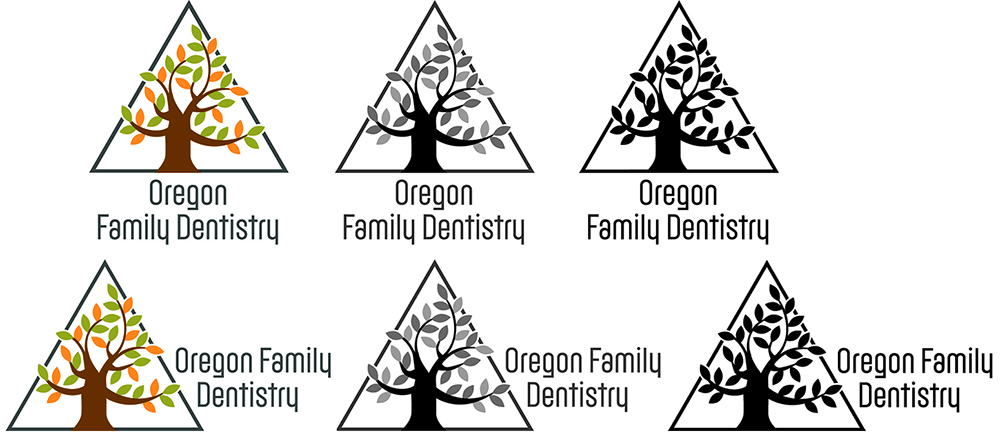
The finalized logo was provided to the client in both horizontal and vertical formats. Also in color, grey-scale, and black and white. In multiple formats for use in printing, web, and more.
In addition to sending the logo in various file formats I also supplied a usage guide.
Project: To create a logo for Oregon Family Dentistry, who for years did not have a logo.
The client did not want a tooth for the logo and they wanted some kind of inside joke or meaning. During initial work it was also discovered that the client did not want a smile or mouth as part of the logo, but would prefer something nature or landscape related.